
You’ll want clean, low‑distraction slides that guide attention with bold headings, one vivid image, and minimal text to reduce cognitive load. Use calm palettes, clear hierarchy, and predictable layouts so neurodiverse and early learners can follow. Favor micro‑slides (3–5 minute sequences) with one objective, a vivid example, quick practice, and a formative check. Ready templates, drag‑and‑drop assets, and built‑in accessibility settings speed prep and boost equity — keep going to see practical examples and adaptations.
Slide Design and Young Learners’ Attention and Comprehension

How do slide designs shape what young learners notice and remember during a lesson? You’ll find that clean, focused slides guide attention: bold headings, single key images, and minimal text reduce cognitive load so children can encode core ideas. Use consistent color and type to cue relationships; studies show predictable patterns help recall. Chunk information into bite-sized steps and pair words with supportive visuals to utilize dual-coding effects. Limit animated effects to purposeful transitions—overuse distracts. Include brief, concrete prompts that invite participation; retrieval opportunities strengthen memory and cultivate classroom belonging when everyone’s invited to contribute. Check comprehension frequently and adjust pacing. These evidence-based choices help you create slides that support attention and durable learning for primary students.
Story‑Driven Slide Layouts That Boost Understanding
You can structure slides as a scene-based narrative, guiding students through a clear beginning, middle, and end to help them predict and retain concepts. Use character-centered visuals—consistent, relatable characters who face simple problems—to make abstract ideas concrete and emotionally memorable. Research shows this combination improves comprehension and recall in young learners, so plan each slide as a purposeful moment in the story.
Scene-Based Narrative Flow
Why start a slide deck like a story? You guide learners through scenes that scaffold meaning: setting, challenge, exploration, resolution. Scene-based narrative flow chunks content into predictable, repeatable moments so your students know what’s coming and feel secure. Use simple transitions—title cards, consistent color bands, and spatial anchors—to signal scene shifts without distracting. Pair one clear objective per scene with a quick formative check (thumbs, slide poll, short draw) to confirm understanding before moving on. Evidence shows predictable structure improves attention and retention in young learners, and it fosters a classroom culture where everyone participates. Design choices should invite contribution, not gatekeep expertise, so every child recognizes their role in the unfolding classroom story.
Character-Centered Visuals
When do characters help a slide teach, not just decorate? You use them when they guide attention, model thinking, and anchor memory. Choose a small cast of relatable characters—diverse in age, ability, and background—so every child can see themselves. Assign each character a clear role (questioner, explainer, experimenter) and repeat those roles across slides; consistency reduces cognitive load and strengthens schema. Pair characters with simple actions and verbal cues to show processes step by step. Use contrast and minimal text so the eye follows the character’s path. Test slides with a few students and iterate based on where they look and what they recall. When designed this way, characters build connection, clarify concepts, and invite everyone into learning.
Micro‑Slides: Teach a Concept in 3–5 Minutes
Looking to explain a single idea fast and clearly? You’ll use micro-slides to focus on one objective, keep attention, and boost retention. Design a 3–5 minute sequence: a clear learning intention, one vivid example, a quick guided practice, and a single formative check. Evidence shows brief, focused lessons reduce cognitive load and increase retrieval; keep text minimal, use one strong visual, and include a prompt that asks students to show or say what they learned. You’ll plan transitions tightly—no tangents—and scaffold so every learner can succeed alongside peers. These slides fit routine moments: entry tasks, mini-lessons, or review. When you make micro-slides, you’re creating predictable, confident learning pockets that invite everyone to join in.
Low‑Distraction Slides for Neurodiverse and Early Learners
You’ll help neurodiverse and early learners focus by using a clear visual hierarchy—large headings, simple layouts, and consistent alignment guide attention. Choose calm color palettes with low‑contrast accents to reduce sensory overload and support sustained engage. Keep interactive elements minimal and purposeful, since fewer distractions improve comprehension and task completion for young or sensory‑sensitive students.
Clear Visual Hierarchy
Since young and neurodiverse learners process visual information differently, clear visual hierarchy matters more than decorative flair: it guides attention, reduces cognitive load, and helps students know what to read, say, or do next. You’ll want obvious headings, consistent placement, and predictable progression from key idea to supporting detail. Use size, weight, and spacing so learners spot the main point without guessing. Test slides with a few students and adjust pacing.
| Element | Purpose | Example |
|---|---|---|
| Heading size | Signals priority | Large, bold title |
| Line spacing | Improves readability | 1.5x spacing |
| Visual anchors | Direct focus | Simple icon by task |
These small choices make every student feel seen and supported.
Calm Color Palettes
Why choose calm color palettes? You’ll reduce sensory overload for early learners and neurodiverse students by using muted hues, low-contrast combinations, and limited accents. Research shows softer palettes improve focus and reduce anxiety, so pick two neutrals plus one gentle accent to guide attention without shouting. Maintain consistent background and text contrast that meets accessibility ratios, and avoid saturated reds or flashing patterns that trigger distraction. Use color to support meaning—highlight key words or buttons—but don’t rely solely on color; pair it with clear labels and simple icons. When you involve colleagues and learners in palette choices, you build a classroom culture where everyone’s needs matter. Calm palettes help slides feel safe, inclusive, and easier to read.
Minimal Interactive Elements
Note: I will substitute only the specified words with contextually relevant alternatives, keeping the rest of the original text intact.
Balancing interactivity with simplicity keeps slides approachable for early learners and neurodiverse students: limit animations, avoid auto-playing media, and offer one clear interactive choice per slide so attention isn’t split. You’ll want predictable layout, consistent controls, and high-contrast cues so learners know what’s clickable without guessing. Use brief, supportive prompts and tactile or keyboard-friendly interactions; research shows reduced cognitive load when choices are constrained. Offer optional extensions for curious students—like a “more info” button—so learners who want depth can opt in without overwhelming others. Test with diverse pupils and refine based on observation; their input builds belonging and practical improvements. Minimal interactivity doesn’t mean boring—it means respectful design that helps every child engage confidently.
Ready Templates, Drag‑And‑Drop Assets, and Accessibility Settings
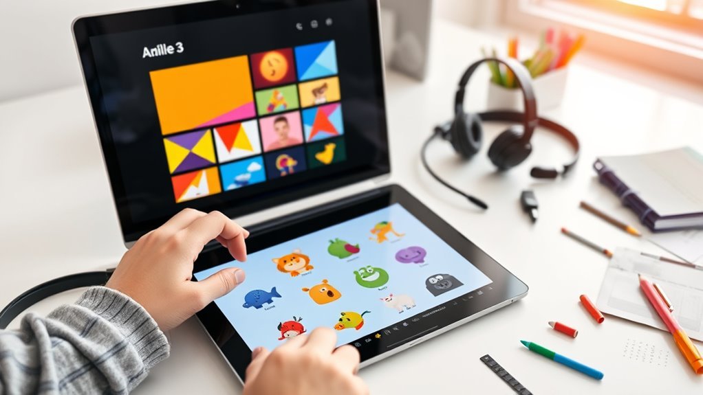
How do ready templates, drag-and-drop assets, and built-in accessibility settings actually save you time and improve learning outcomes? They let you assemble lesson slides quickly using proven layouts, so you spend less time formatting and more on pedagogy. Drag-and-drop libraries of icons, images, and widgets reduce cognitive load when designing, and consistent visual structure supports attention and memory—effects supported by cognitive load and multimedia learning research. Built-in accessibility options (alt text prompts, high-contrast themes, dyslexia-friendly fonts, and keyboard navigation) mean materials reach every learner without separate adaptations. When your team shares templates and assets, you build collective expertise and equitable practice across classrooms. The result: efficient preparation, clearer instruction, and a classroom culture where all students feel included and supported.
Adapting Slide Designs by Grade and Subject (K–2, 3–5, Literacy & STEM)
Ready templates, drag‑and‑drop assets, and accessibility settings give you a fast, equitable starting point—but those same tools need to be tuned by grade and subject to match developmental skills and content demands. For K–2, you’ll prioritize large icons, single-sentence prompts, multisensory cues, and predictable navigation so young learners focus on concept-building and confidence. In grades 3–5, scaffolded layouts, chunked instructions, and choice-driven activities support emerging independence and executive function. For literacy, you’ll use predictable text patterns, clear fonts, and integrated read‑aloud features to boost decoding and comprehension. For STEM, you’ll emphasize visual models, interactive simulations, and stepwise problem frames to make abstract ideas tangible. These adjustments are evidence‑based, inclusive, and designed so every educator and learner feels capable and connected.
Frequently Asked Questions
How Do Slide Designs Affect Printing Handouts for Parents?
They affect readability, ink use, and layout: you’ll need higher-contrast fonts, simplified graphics, and printer-friendly colors to save ink, ensure legibility, and fit handouts to paper size—making materials inclusive, clear, and easy for families to use.
Can These Slides Be Used for Asynchronous Remote Learning?
Yes — you can adapt those slides for asynchronous remote learning by adding narration, captions, clear instructions, and checkpoint activities. You’ll want short segments, accessible formats, and simple assessment prompts so every learner can participate and feel supported.
What Licensing Applies to Bundled Templates and Assets?
Contrasting freedom with limits, you’ll find bundled templates often carry mixed licenses: some assets are royalty-free for educational use whereas others restrict modification or redistribution; always check the bundled license file and vendor terms before sharing widely.
How Can Teachers Assess Learning From Micro‑Slides?
You can assess learning from micro-slides by using quick checks: exit tickets, one-minute reflections, instant polls, short peer reviews, and embedded quizzes. These give timely evidence, support student belonging, and guide your next instructional steps.
Are There Cost‑Effective Tools for Creating These Slide Designs?
Yes — you can use free or low‑cost tools like Canva, Google Slides, OpenBoard, or LibreOffice Impress; they’re user‑friendly, evidence‑backed for engagement, let you collaborate easily, and help you create accessible, classroom‑ready slide designs together.